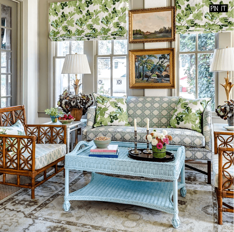
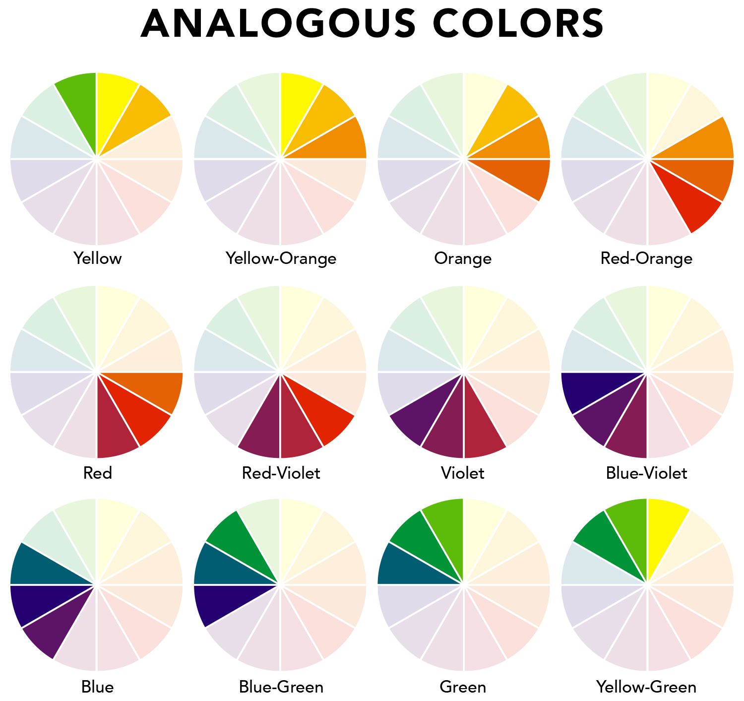
When it comes to creating a cohesive and calming space, color is everything—and one of the simplest, most effective ways to harness its power is through an analogous color palette. This approach uses colors that sit next to each other on the color wheel—like blues and teals, or reds and oranges—to create a sense of visual harmony that feels natural and unified.
So why choose an analogous palette? Here are the key advantages:
1. Effortless Harmony
Analogous colors naturally go well together because they share a common hue. For example, if you start with a rich navy blue and add teal and soft turquoise, they’ll all share blue as a base. This makes it hard to “get it wrong” and ensures your space feels intentional and pulled-together without a lot of second-guessing.
2. Soothing and Cohesive
Because analogous schemes avoid jarring contrasts, they’re ideal for spaces where you want to relax and unwind—like bedrooms, living rooms, and reading nooks. These palettes create a seamless visual flow, which is especially useful in open-concept homes where you want each room to feel distinct but connected.
3. Flexible Mood Setting
Even within an analogous range, you can play with tone and intensity. A yellow-orange-red palette can feel warm and energizing, while a blue-green-indigo combo might be more cool and serene. You can also control the mood by tweaking the value (lightness or darkness) and saturation (intensity) of each color.
4. Great for Layering and Depth
Using several related hues opens up opportunities for layering—something every good interior relies on. You can vary your chosen colors across wall paint, upholstery, artwork, rugs, and accessories, creating a space that’s rich and complex without becoming chaotic. Think pale olive walls with sage linens and forest green accents—every layer builds on the last.
5. Ideal for Vintage and Thrifted Decor
If you’re decorating with the TGIF method (Thrifted, Gifted, Invented, Found), analogous palettes are your best friend. You can mix and match pieces from different sources and eras, and as long as they fall within the same color family, they’ll work together visually—even if their styles vary.
In a nutshell: analogous color palettes are a low-risk, high-reward strategy for creating beautifully balanced interiors. They let you build depth, convey mood, and tie together eclectic elements, all while giving your home a subtle but sophisticated sense of unity.
If you’re unsure where to start, grab a color wheel. Pick your favorite hue, then choose one or two neighbors on either side. Stick within that range, and let texture, shape, and materials do the rest of the talking.
Need help picking your color palette?
Leave a Reply