Color isn’t just a visual experience — it’s a psychological one. It shapes how we feel in a space before we ever have a chance to think about it. A room’s color can soothe or energize, focus or distract, uplift or overwhelm. That’s why choosing the right hue for the right room is one of the most quietly powerful decisions you can make in your home.
Let’s walk through some key rooms and how color can help them live up to their full emotional potential.
Living Room: Warm, Sociable, and Grounding
The living room is where energy gathers — conversation, activity, and often the first impression of your home. Warm neutrals like terracotta, muted ochres, or warm grays create a cozy, welcoming foundation. If you want something bolder, deep olive or burnt orange can bring life without overstimulating. These hues foster connection and comfort — both essential for a space meant to be shared.
Kitchen: Fresh, Clean, and Bright
In the kitchen, clarity and cleanliness are key. Whites and soft greens evoke freshness, while yellows can stimulate appetite and cheer. If you’re going bolder, consider navy or forest green for grounding — but balance them with light surfaces so the space still feels clean. This is one room where natural light and reflective surfaces matter just as much as the paint swatch.
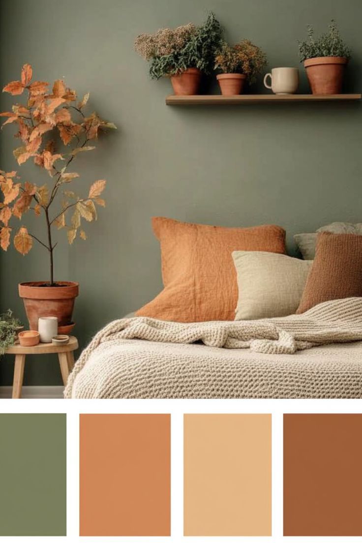
Bedroom: Calm, Cool, and Restorative
The bedroom is your sanctuary, and your color choices should reflect that. Blues — from powder to midnight — are often ideal here. They’re known to lower blood pressure and slow the heart rate. Soft sage, lavender, or smoky lilac can also create a restful mood without feeling sterile. Avoid overly saturated reds or bright yellows — they’re energizing when you want your space to lull you.
Bathroom: Light, Spa-like, and Inviting
Bathrooms benefit from a sense of cleanliness and calm. Light blues, off-whites, or pale blush tones can mimic a spa environment. If your bathroom lacks natural light, avoid cool grays which can feel cold and unwelcoming. Instead, lean toward warmer neutrals with a hint of color — think sand, cream, or even a very pale peach.
Home Office: Focused, Balanced, and Clear
You want a color that keeps you alert without putting you on edge. Mid-tone blues and greens promote concentration and reduce stress. Want a little creative energy? Try a desaturated coral or mustard — colors with personality, but not volume. Avoid dark colors unless the space gets tons of natural light, or they can become oppressive over time.
Beyond the Color Wheel
Of course, no color exists in a vacuum. The finish matters (matte vs. gloss), the light matters (north-facing vs. south), and the material matters (paint, plaster, fabric, tile). And, in our work, the story behind a piece — whether it’s a thrifted velvet chair or a gifted ceramic vase — can be just as important as the palette.
At Object Lesson, we believe your home should reflect who you are and how you want to feel. That starts with noticing how color already affects your day-to-day. What hues make you breathe deeper? Which ones help you shift gears from work to rest? That awareness is the real starting point for great design.
Leave a Reply